

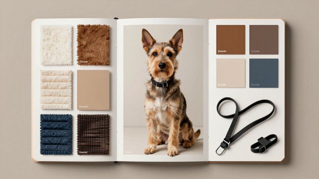
Dog branding is the system that gives a pet business a clear identity, trusted voice, and consistent presence across every touchpoint. It combines name, logo, colors, typography, imagery, and tone into one recognizable experience. Strong dog brands define a clear purpose and promise, then reinforce them with repeatable standards, approved visuals, and measured outcomes. Done well, branding builds recognition, loyalty, and trust, while keeping teams coordinated and credible as the market becomes more crowded.
Disclosure: This post may contain Amazon affiliate links, at no extra cost to you. Content on Pawtangle is created with research support from AI tools and carefully reviewed, edited, and fact-checked by the lead author, Dr.Fahri Pat , to ensure accuracy and reliability. Learn more
Key Takeaways
- Dog branding creates a consistent identity through logo, colors, typography, imagery, and voice across every touchpoint.
- A strong dog brand communicates purpose, promise, values, and trust with clear rules for assets and naming.
- Real photography, approved colors, and disciplined typography build authenticity, recognition, and community belonging.
- Brand governance matters: centralized channels, consistent profiles, and Marketing approval prevent drift and protect credibility.
- Effective dog branding uses KPIs, storytelling, and operational guardrails to support loyalty, differentiation, and premium value.
What Is Dog Branding?
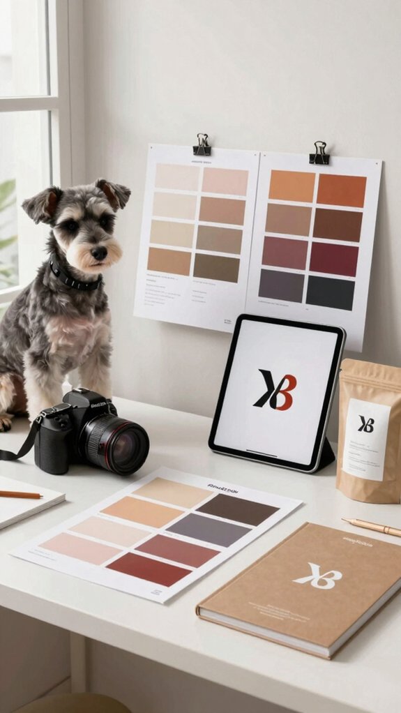
Dog branding is the deliberate creation of a consistent identity for a dog-related business or program, coordinating name, logo, colors, typography, imagery, and voice to strengthen recognition, trust, and perceived value in a competitive pet market. It translates purpose, promise, values, and tone into a system people can identify and join. Effective branding specifies rules for logos, typefaces, palettes, photos, and naming conventions, then applies them across every touchpoint. It also harmonizes messaging with audience needs, using behavioral cues and sensory branding to signal fit. The result is a cohesive presence that feels familiar, credible, and community-minded.
Why Dog Branding Matters for Pet Businesses
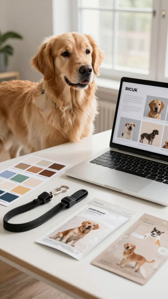
In a crowded pet market, a business’s brand can be the difference between being noticed and being overlooked. Strong dog branding lifts perceived value, supports premium pricing, and builds loyalty as competition intensifies. A consistent logo, palette, typography, and tone make a company instantly recognizable and trusted, especially when purchases are guided by emotion. Emotional storytelling turns buyers into advocates, while targeted messaging speaks to urban millennials, first-time pet parents, and premium shoppers. Branded touchpoints, from sensory packaging to social content and service tone, reduce hesitation and encourage repeat purchase behavior.
Define Your Dog Brand Purpose and Promise

A strong visual identity only goes so far unless the brand also defines what it stands for and what customers can expect every time. Purpose should name the dog owner problem solved and the measurable result delivered, such as fewer relinquishments and higher satisfaction. Promise should specify the repeatable experience: training methods, placement age, health screenings, and post-placement support. Evidence from adoption data and program metrics sharpens positioning. Customer-facing touchpoints then repeat the same value with clarity. Operational guardrails, feedback loops, community partnerships, and legacy storytelling protect credibility and help owners feel they belong to something dependable and shared.
Choose a Dog Brand Name and Tagline

With a name and tagline, the brand begins to become searchable, memorable, and positionally clear. Strong names are short, easy to say, and distinct from generic pet terms, supporting SEO Testing and discoverability. Playful Naming can signal warmth for urban owners, while polished choices suit premium segments. The tagline should be concise, usually 3–7 words, and carry an emotional promise that helps people feel included. Before launch, small audience tests, language checks, and Trademark Checks reduce risk. Together, name and tagline should read cleanly, sound natural, and fit partner rules across every touchpoint.
Build a Visual Identity Dog Owners Trust

A visual identity gains trust when it uses real, current breed photography with pups in approved coats, paired with warm illustrative accents that feel credible rather than contrived. A disciplined system of color, type, and logo use then reinforces recognition across packaging, social, and apparel, making the brand feel consistent and dependable. Clear asset rules and marketing approval help preserve that consistency, protecting both professionalism and consumer confidence.
Trustworthy Visual Signals
Trust is built visually before it is earned through experience, so the brand should present current, high-resolution photos of Labrador Retrievers, Golden Retrievers, and approved crosses—especially puppies in official coats—to signal authenticity and breed adherence at a glance. High trust seals and authenticity cues should appear on apparel, social profiles, and event signage, using the approved Guide Dogs for the Blind – {City} Puppy Raisers logo unaltered. Hand-drawn breed illustrations can add warmth when accurate. A restrained navy-and-cream or green-accented palette, paired with clear, premium imagery, helps dog owners feel they are joining a credible, mission-aligned community.
Consistent Brand System
A coherent visual system turns the brand into an immediate signal of legitimacy and care. Core elements—logo, navy-and-cream palette, Gotham or substitutes, and approved illustrations—should appear unchanged across every touchpoint. | Element | Standard | Checkpoint |
| — | — | — |
|---|---|---|
| Logo | Intact, black/white | Clear space |
| Color | Navy and cream | Specified codes |
| Type | Gotham/Calibri/Arial | Hierarchy |
| Images | Approved dog photos | Breed accuracy |
| Assets | JPG/PNG/AI files | Production fit |
Consistency checkpoints protect apparel, signage, and digital profiles from drift. Tactile materials and premium finishes should reinforce warmth. Social handles, website fields, and rollout approvals keep members aligned, recognized, and confidently included.
Choose Colors, Fonts, and Images
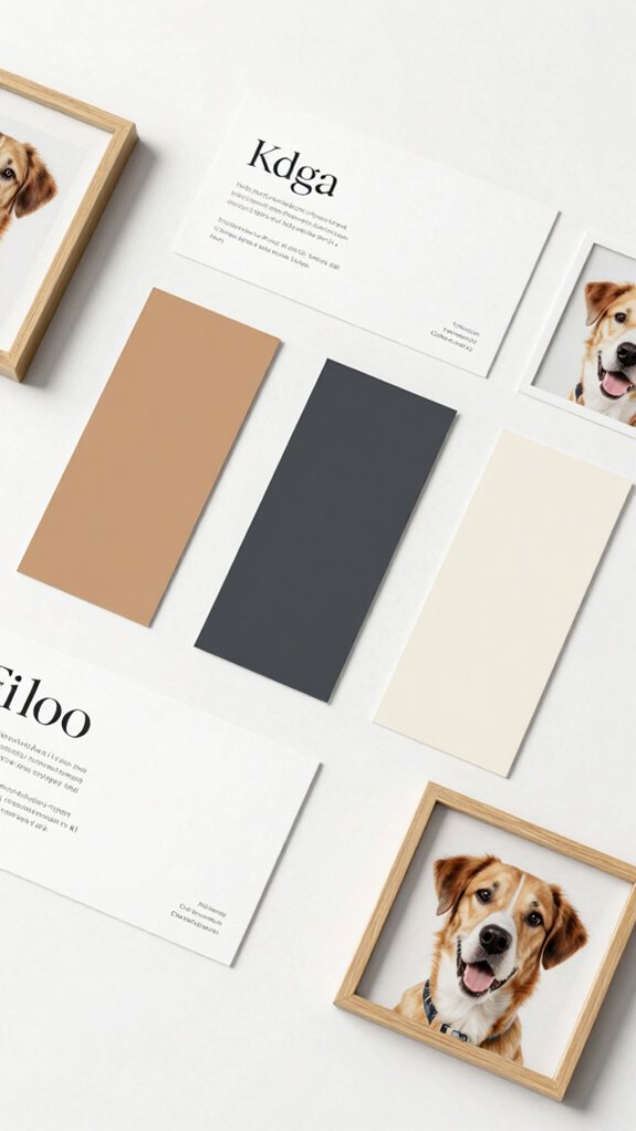
A disciplined color palette, limited to two or three hues with one dominant shade, helps the brand remain instantly recognizable across packaging, apparel, and social channels. Typography should follow a clear hierarchy, with a defined primary family and reliable substitutes so every headline and body copy feels consistent and readable. Strong imagery then reinforces trust through high-resolution, natural photos and simple supporting graphics that stay consistent with the brand system.
Color Palette Basics
Color acts as the brand’s shorthand, signaling position and shaping how quickly shoppers recognize the product. A disciplined palette uses 2–3 core colors, such as navy and cream, then 1–2 accents like coral or sage to separate premium from friendly cues. Breed specific palettes can strengthen relevance, while seasonal accents keep the system current without losing cohesion. Color-coded modular packaging helps shoppers scan life stages faster and feel they belong to a clear family of products. White space should stay generous, supporting visual calm. Brand-safe green backgrounds and approved logo treatments preserve consistency across print and web.
Font Choices Matter
Font choices help define the brand’s tone at a glance, with a primary typeface selected to match the intended personality—whether a modern sans like Gotham or a softer serif for a more nurturing, premium feel—then anchored by a web-safe fallback such as Arial or Calibri for consistency across print and digital. Two to three weights usually preserve hierarchy without clutter, while display styles stay reserved for headlines. Careful typographic rhythm supports a calm, cohesive voice, and legibility testing confirms readability across sizes. Paired with restrained color use and ample space, the system helps audiences feel included, informed, and confident.
Select Strong Imagery
By pairing a limited palette of three to five colors with a dominant trust-building hue such as navy or green and a contrasting accent like coral or cream, the brand can guide attention while preserving legibility at standard contrast ratios. Strategic imagery then strengthens belonging: current Labrador, Golden, and cross breeds, photographed at eye level in approved puppy coats, feel familiar and welcoming. Soft-serif headlines and clean sans-serif body copy support warmth and clarity. Realistic icons, ample white space, and black-or-white logos maintain order. Veterinary collaborations and scent focused imagery can deepen credibility across print and digital touchpoints alike.
Create a Brand Voice for Every Channel
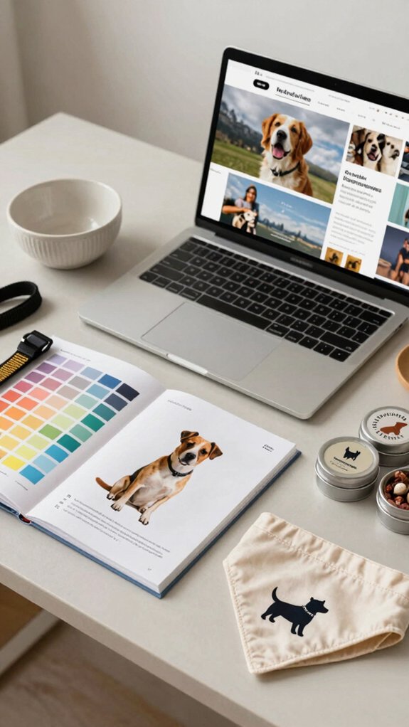
A strong dog brand speaks with one voice, even as its delivery shifts by channel. It should define two or three tone traits, such as empathetic, playful, and authoritative, then document examples for community outreach and sensory marketing so every touchpoint feels familiar and welcoming. Sentence length, vocabulary, and lexicon should adjust by platform, while approved terms and banned words protect compliance. Channel-specific snippets, canned replies, and caption rules keep teams aligned. Measurable KPIs tie voice to results, and Marketing approval for deviations preserves consistency, trust, and belonging across the audience.
Apply Your Brand to Packaging and Socials
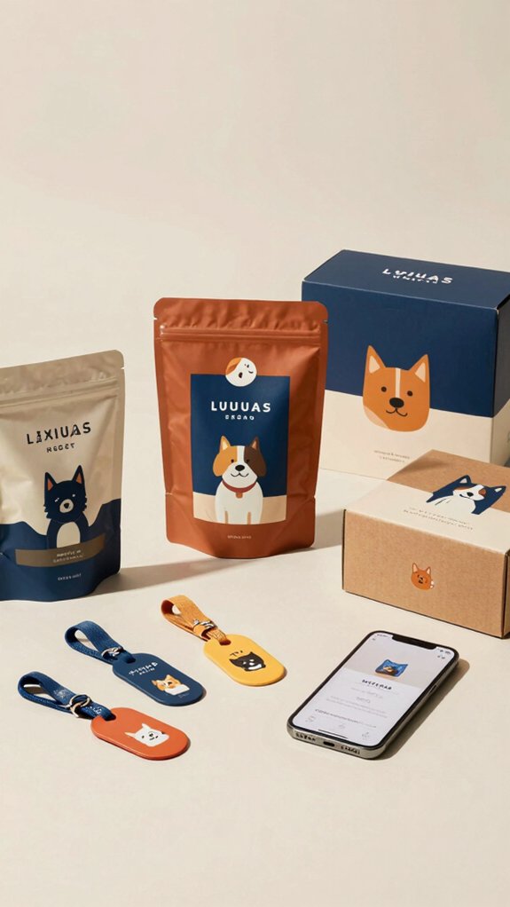
Packaging and social profiles should present one unified identity, with the same naming format, puppy-raiser logo, and brand green or approved visuals used consistently across every touchpoint. Brand standards also matter in the details: approved puppy imagery, Gotham or suitable substitutes, and platform-specific fields should all harmonize to reinforce recognition and trust. Any merchandise or packaging design should place the logo visibly, follow print-ready file requirements, and be reviewed before production to protect brand integrity.
Packaging Consistency
Across packaging and social channels, brand consistency turns each touchpoint into a recognition cue: the same logo lockup, navy-and-cream palette, and Gotham-style typography should appear on every SKU, post, and highlight, while modular color bands, coordinated product photography, and matching empathy-first microcopy make flavors, sizes, and age ranges easy to identify at a glance. Seasonal promos and sustainability materials can stay on-brand when the same visual system frames them. Realistic dog imagery, approved gear, and ample white space reinforce trust. Before release, each design should pass brand review to confirm logo, color, and legal accuracy.
Social Profile Branding
Social profile branding should function as a quiet, repeated signal of legitimacy: club pages use the exact naming convention, with Facebook listed as “Guide Dogs for the Blind – {City} Puppy Raisers” and shortened platform-safe variants only when required, while first-reference copy spells out Guide Dogs for the Blind before using GDB.
- Use approved club visuals and the GDB Puppy Raiser logo.
- Match bios to the approved templates.
- Set the website field to guidedogs.com.
- Use audience targeting through city-based handles and names.
- Keep imagery limited to approved puppies and coats.
Visual Brand Standards
Building on the approved naming and profile conventions, the visual system should carry through to packaging and social assets with the same disciplined consistency. The logo lockup must remain intact, with required clear space, using only approved files and no recoloring beyond sanctioned black or white. The green identity palette supports belonging, while navy and cream uplift product cues; contrast must remain accessible. Gotham, or Calibri and Arial substitutes, should govern label and post typography. Realistic breed textures, approved coats, and disciplined Collar typography reinforce trust. Any new creative requires GDB Marketing approval before release.
Keep Your Brand Consistent Everywhere
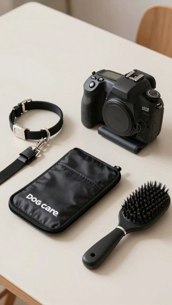
Consistency should be treated as a core brand control, not a design preference. For Guide Dogs for the Blind – {City} Puppy Raisers, every channel should signal belonging and trust. Use the full name first, then GDB; keep handles, fields, and imagery consistent across social, print, and email.
- Facebook name: GDB {City} Puppy Raisers
- Instagram: @GDB{City}PuppyRaisers
- Website field: guidedogs.com
- Current-brand photos, current puppy coats, and approved type keep local events and volunteer coordination recognizable
- Consult GDB Marketing before new accounts, merchandise, or logo changes
Avoid Common Dog Branding Mistakes
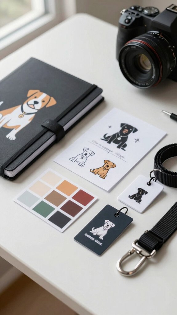
Common branding mistakes can quietly weaken recognition and trust, especially when a club uses vague names, inconsistent platform naming, or visuals that do not correspond with the organization’s standards. Strategic clubs avoid clichéd pet names and instead choose distinctive titles that secure domains and social handles, strengthening discoverability. They follow official naming conventions across pages and volunteer groups, keeping the community easy to find and trust. Centralized channels often work better than separate sites. Inconsistent logo use, altered marks, and mismatched styles signal disorder. Harmonized typography, color, imagery, and tone help members feel they belong within a credible, unified brand.
Frequently Asked Questions
How Do I Test My Dog Brand With Real Customers?
It can test the dog brand by running focus groups with target owners and offering product sampling to real customers. Their reactions, repeat interest, and word-of-mouth reveal belonging cues, pricing fit, and brand resonance.
What Legal Checks Should I Make Before Finalizing Branding?
He should verify trademark search results, domain availability, and company name registration, then review copyright, licensing, and advertising claims. He should confirm the brand avoids infringement and feels trustworthy, welcoming customers into a distinct community.
How Often Should I Refresh My Dog Branding Guide?
He should refresh it annually, with seasonal updates as needed. Regular reviews keep messaging in harmony, relevant, and welcoming, helping the brand feel current while preserving a consistent sense of belonging for its audience.
Can a Small Pet Business Create Branding Without a Designer?
Yes. With budget friendly visuals and owner led storytelling, a small pet business can craft a coherent identity in-house, using simple colors, symbols, and tone to welcome customers into a familiar, trusted community.
How Do I Measure Whether My Branding Is Working?
Branding is working when brand awareness rises, customer retention improves, and more people return, refer, and participate. Tracking inquiries, repeat purchases, and sentiment reveals whether the brand creates recognition, trust, and belonging.